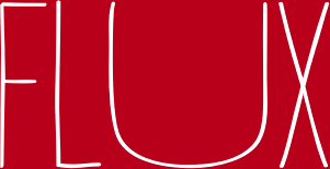
Now that i have made the final decision on the name of my magazine i have decided to test out fonts that could potentially be the masthead on my front cover. I am still slightly unsure whether i would like my font to come from the left of the magazine and finish half way. Examples of this would be Spin and NME magazine. I think to this i would use a font which is less bold and something slightly more artistic, rather than just bold. Sticking to the colour scheme which i hope to present on my magazine, here are a few examples:
Next i have also looked at some fonts which i would use if they were to be spread across the whole of my magazine. I feel that this font would need to be something much clearer than the previous. Here are a few more examples of fonts i am going consider. As you will be able to see they are all very similar are carry the same common features.


No comments:
Post a Comment